Typeface is not something most people think about on a day-to-day basis. For font designers like Dave Crossland, though, that’s all he thinks about.
“(Typography has) been around hundreds of years,” Crossland, a project manager at Google Fonts, said. “It’s been around hundreds of years, and yet in 2024, we’re still coming up with new things to do about it.”
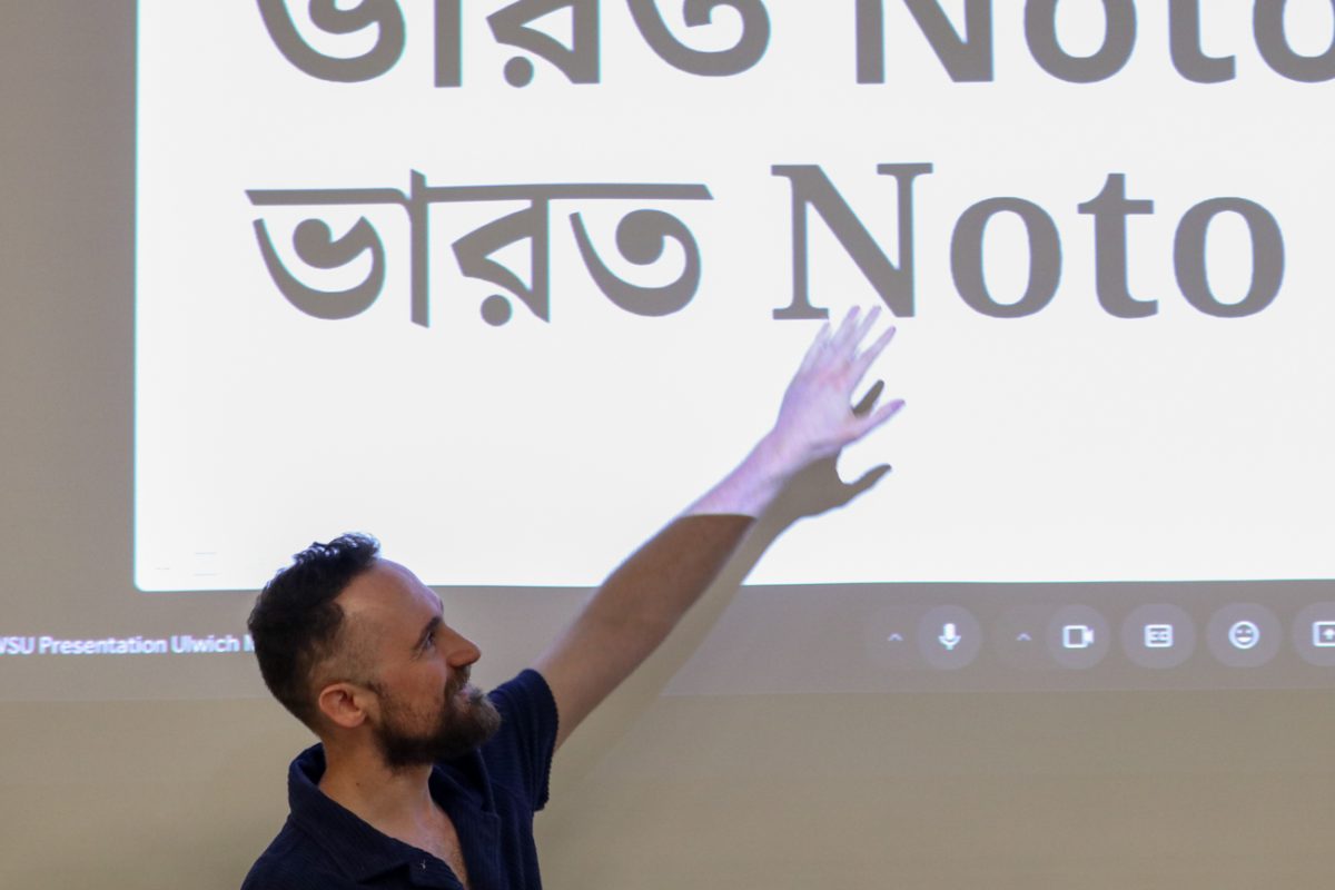
The School of Art, Design and Creative Industries hosted its first typography workshop called MIDPOINT, a two-day event hosted by two guest speakers who are influential in the typography industry. Crossland, MIDPOINT’s first speaker, concluded his first day of workshops with an open lecture that considered “the power of type” through the lens of his work experience.
“I was exposed to these things, global perspectives of this,” Crossland said. “And so I became aware of the power of type, not only for the Latin alphabet, but around the world.”
Crossland’s passion for typography ignited as a student at Ravensbourne University London, where he became interested in designing a typeface.
“And the teacher told me, ‘No, you’re not allowed to design your own typeface at school’ because they didn’t have any experience teaching it,” Crossland said. “It was fair enough, but it made me keen to learn these secrets.”

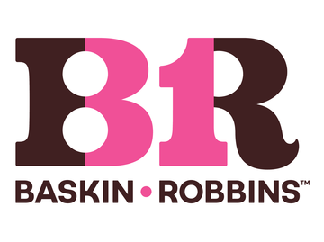
Crossland pulled examples from all over to show how Baskin Robbins had the same typeface in India and in America, emphasizing his goal to increase the frequency of originality in typography.
The majority of his lecture, though, was the science behind creating fonts. Crossland showed off many different fonts that used the science of optical illusions and math to create different effects.
“You set up some kind of rules about your typography to determine exactly which type to use to get the type of graphic out,” Crossland said. “You set up some constraints, some conditions, and then you let the computer decide what value to pick based on these conditions.”
Crossland explains how having a rhythm to your typeface is important.
“We’re looking at how the type already occurs,” Crossland said. “And so a big concept is (that) typeface is not individually beautiful letters. It’s the collection itself, which is a beautiful thing. This has got a real impact of how typeface changes your experience reading.”
Shani Avni, who works on Hebrew typeface, hosted a few different workshops at Midpoint. Avni serves as the Ismar David visiting assistant curator at the Cary Graphic Arts Collection in New York.
On the event’s second day, Avni gave a comprehensive presentation on Hebrew type, encapsulating its historical developments and complexities compared to Latin script.
“This still is a very ongoing process for me where I’m working closely with these letters, and I’m learning, and I’m sharing what I’m discovering. And I just have to say that my favorite way to share these letters with students and with whoever is interested is through workshops.”
In 2014, Avni acquired a large and rare collection of Hebrew wood type that she’s working to grow and share, as well as the workshops and presentations, by uploading them online in a free and accessible manner.
“These are industrial artifacts that are meant to be touched and used and get dirty, and we are trying to do as much as we can, as much workshops and sessions as we can,” Avni said.
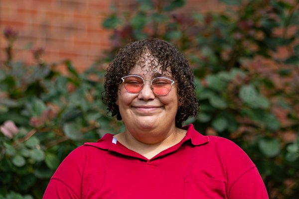
Senior Gloria Esparza said she attended because she found typography that wasn’t Latin script interesting.
“I think acknowledging other parts of the world language is important, so it’s interesting to learn something different,” Esparza said.
Attendees were also able to create a project using Hebrew types.
“I’m hoping to get into graphic design and maybe that this workshop would help me understand more about graphic design and what other niches are in it,” sophomore Serena Chau said. “I hope there’s more workshops in WSU. I feel like we don’t really have that many workshops here.”
Crossland encouraged young graphic designers to continue with their work.
“This is a big opportunity for students; the next generation of typography, ” Crossland said. “Typeface design is a tiny niche within a niche within a niche. Type design is this tiny, tiny, thing, yet the people who make type have this enormous influence because text is so big to us.”


