This is the last year Wichita State basketball jerseys will feature the mirrored arches of Under Armour. With the switch to Nike set for next summer, let’s take this moment to look back on the extensive jersey history of WSU’s men’s basketball team.
I have courageously spent many hours combing through every home jersey since 2010 and ranked them, from a slam dunk to a complete airball. Some jerseys elicited feelings of Shocker pride, while some, well, I’m surprised they made it off the idea board.
#6: 2016-17

This jersey is truly a waste of fabric. “Shockers” is barely legible with the font choice. The cursive blurs the letters together and makes reading more difficult as players move fast on the court.
The yellow outline on the words mixed with the white background makes it seem like the letters are floating off the fabric and into my pupils, burning my retinas.
Also, the odd black triangles on the shoulders are just silly. They don’t even reach to the back of the shoulder. They’re just on the front which confuses me almost as much as putting cursive on a jersey. You’re not Tony from “Jessie”; stop trying to wear epaulets.
I’m deducting extra points for the shorts being nothing special. They’re white with a single black stripe and the WuShock logo. It’s not terrible, but it’s lacking the flair to make up for the horrendous jersey.
I’m truly pleased we moved on from this despicable era.
Shocker Spirit: 0.5/10
#5: 2010 – 2013

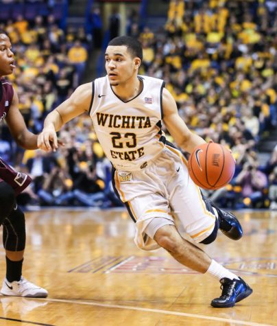
This era of jersey was extremely close to dead last but escaped it by a single factor: I can actually read the words. The font is still atrocious but only because it looks like Times New Roman and makes me feel like I’m rereading my old English essays.
The shorts, which have a yellow stripe up the side, may be the only interesting thing about this jersey.
WSU’s team hadn’t garnered enough attention during this era, and we didn’t even have a brand represented on the jersey even though we were partnered with Nike.
My biggest gripe with this era though isn’t the font, or the stripes, or how the lettering is too small. No, it’s the V-necks. I hate them. It’s just unnecessary and it looks somewhat unprofessional.
The designers of these jerseys should only be comforted by the fact that it was so mediocre that probably barely anyone remembers.
Shocker Spirit: 3/10
#4: 2017-18

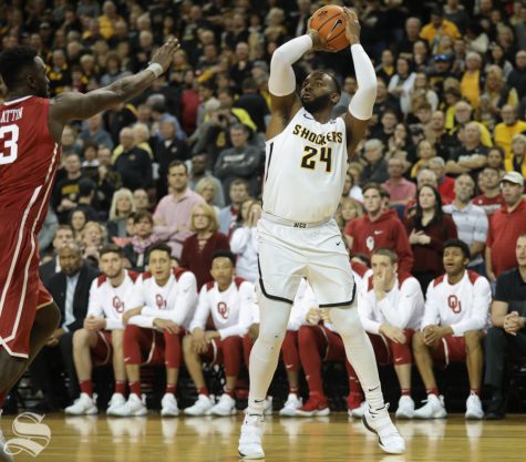
First things first, I enjoy that the jersey says “Shockers” (in a legible font) instead of “Wichita State.” I also am a fan of the shorts saying “WSU” on the waistband. It adds a certain charm.
That’s where the exceptionalism ends.
The font choice, once again, lacks unique qualities. It doesn’t have the sharp edges on the ends of the letters that later designs have. The yellow outline is also too pale to be considered Shocker yellow.
The black stripes on the sides of the jersey and shorts feel like they were placed at the last minute to add something of interest, but they fell flat and left me wanting more of the flair they so desperately tried to emulate. This jersey was overall disappointing.
Shocker Spirit: 4/10
#3: 2013-2016

Prior to the 2013-14 season, Wichita State was represented by the Jordan brand, a subsidiary of Nike, but the logo didn’t appear on the jersey. After Wichita State’s Final Four run in 2013, Nike capitalized on the team’s newfound prominence to place their logo on the jersey.
The V-necks make a second unfortunate appearance during this era.
I like the black and yellow stripes on the sides of the jersey and shorts. The pattern is a nice addition that really adds to the character of the jersey.
For the first time in this ranking, this jersey feels like it came from a WSU mind.
Shocker Spirit: 6/10
#2: 2021-25

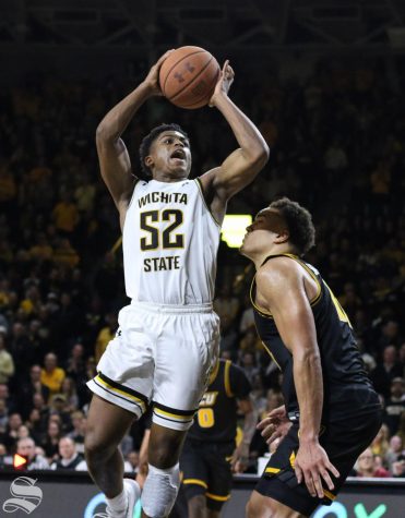
Falling short of the gold medal is the most modern era of jerseys. This is, overall, a great design. WSU stepped away from V-necks and gave them a normal neckline. There’s no horrid yellow surrounding the lettering. The yellow on the jersey is an actual Shocker yellow.
The yellow and black trim around the edges is a solid addition. They bring the design together and make it look crisp. The waistband has the same yellow and black pattern and adds a flair that previous jerseys lacked.
These are also the years when pins were added, showing what college each player studies in. It is a fun addition that lets fans see the players as students and what interests come together on the court.
The only concern I have with the design is the numbers, primarily the number “5” looks like an “S.”
Strong designs came from this era but there’s just enough lacking in style to tip the scales to silver.
Shocker Spirit: 8/10
#1: 2018-21

Coming in first place is 2018-21. These were the best jerseys produced by Wichita State since 2010, though it was a close battle between this and the current look. The primary differences that set these jerseys apart were lines and numbers.
This design adds more stripe variety on the hem of the shorts which really brings the whole thing together. Whereas the 2021-25 jerseys stripes go black and then pure yellow, this set goes black, white, yellow, white, a thin line of black, and white.
The numbers on the jersey are outlined in yellow, but for one of the first times, it’s that Shocker yellow that I only associate with WSU. The numbering looks more appealing as it doesn’t look like the alphabet hiding within player numbers.
The design is crisp and I can feel the spirit of WuShock himself emulating from the cloth.
Shocker Spirit: 11/10


