

Signs of change: New signage hints at WSU history
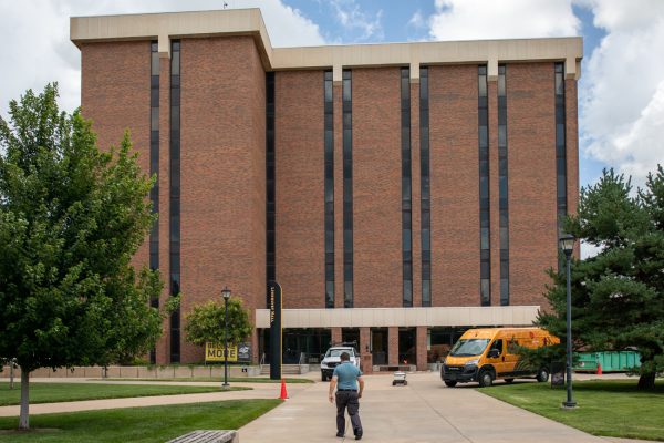
Anyone walking around campus is sure to notice the new 18-feet-tall signs in front of many of the buildings.
In a partnership with Gardner Design, the university brought in a new signage system that features maps, way-finding signs and building placards to help visitors, as well as students, find their way around.
“The project actually started to develop when the Rhatigan Student Center was still under renovation,” said Barth Hague, associate vice president of Strategic Communications and chief marketing officer.
Hague said the plans date back to 2012, the first year the RSC was under construction.
After a period of planning and approval, the new signs started appearing on campus in the spring. More signs were placed over the summer and some have been placed this semester.
Hague said the entire project cost $1.75 million. The money used to pay for the signs was saved spending money from 2013 that rolled over into the next year, so that tuition and fees weren’t raised in order to cover the costs.
The project is split into two phases.
“The first phase was an effort to cover the core of the campus, essentially … Phase two is basically going to be the perimeter,” Hague said.
With phase one nearing completion, the plan is to move on to phase two soon, Hague said. In addition to the primary two phases, signs will be placed on the new Innovation Campus as it is being built. The old brick building signs on campus will be taken down as part of the project.
The design for the new signs carries intentional symbolism.
“The material that these things are made out of — they’re aluminum … Aircraft are made out of aluminum,” said Bill Gardner, president and founder of Gardner Design. “And, if you take a look at these signs, they have almost just kind of a wing configuration to them.”
Not only do the signs represent the aircraft industry of Wichita, but they are also reminiscent of wheat.
“This wheat pattern is obviously associative to the wheat shockers and the fact that university students used to raise funds for their college education by going out to shock wheat,” Gardner said.
In fact, the shapes of wheat grains on the signs are cutouts. This allows for a visual effect when sunlight shines through them during the daytime. At night, many of the signs will be lit up.
Although they are visually appealing, the biggest concern is if the signs will help people find their way.
“First of all, I wanted them to function,” said Brian Wiens, designer and art director for the signage project at Gardner Design. “You had to be able to see the signs and see them from a distance … We were drawn toward things that were tall and kind of slender. So that would fit in with the environment, but could be seen but not seen at the same time.”
Freshman Loi Vo said he thinks the signs function well.
“I do like them because when I’m looking at a distance, from far away, they give me a good idea of which building is which,” Vo said.
Senior Josh Barden said he thinks the new signs are good for the university.
“I think it’s a better thing for the university to spend money on — helping students find their way around,” he said. “I would say it’s a wise investment.”